In an article we published last week titled Responsive Web Design – A Quick Overview, we introduced this new approach to design. We began by covering the rise of mobile websites and the traditional approaches to addressing the various screen resolutions. After looking at pros and cons of the traditional approach, we looked at the rise of responsive design.
When discussing this concept with our web design clients, we often find that they conceptually grasp what we are describing. It’s not until they actually see Responsive Web Design in action that they truly gain appreciation for this approach.
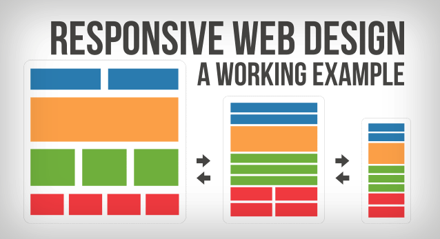
Let’s begin by looking at a relatively simple website layout design. We have a navigation bar with a logo, a few links, a dropdown menu and a search form. Next, our layout includes a slider and then several rows showcasing 2, 3 and 4 column designs. Remember, that this entire layout is powered by CSS, allowing us to easily make changes across the entire website.
If you’re ready to look at our responsive web design demo, please click here.
At first glance, there is nothing particularly “responsive” about this design. You’ll notice, that we added a prompt on the bottom right for the user to “resize” the screen.
So let’s take a look at what happens. For this walk-through, we’re going to assume you are viewing this on a desktop, with monitor which is 1200+ pixels wide. If you’re on a desktop with a smaller monitor, please stop reading this article right now and go buy a new monitor.
Note: You’ll notice we added an overlay that will stay consistent throughout all the screenshots. This will help you get a an idea of how much the screen is being resized.
The initial look is designed for larger monitors. Here is the way the website looks at full resolution:

As we begin to reduce the width, you’ll notice that the slider becomes smaller and all column widths begin to shrink proportionally. You will also notice that the images within the “Heading 1/3” columns have shrunk a bit “on-the-fly” to accommodate the new narrower columns. This layout is intended for smaller monitors.

To preview what this layout will look like on an iPad or other tablets, we’ll continue to make the window narrower and you’ll see some more major changes. Most noticeably, you’ll see that the top navigation bar is now gone! Well not exactly, it is still there, but has now been replaced with an icon. When the icon is clicked, a new dropdown-style navigation is introduced. This style will be used beginning with this width and all the way to the narrowest layout offered by this design. Again, the columns and the images have resized to fit the new screen width.

As we continue, you’ll see that we abandon the different width columns, and we’re now working with a single column design. This layout will work great for an iPad held vertically, and other smaller tablets.

Finally, we can bring the layout all the way down, we’ll see the slider continue to shrink, and again, the images are resized to fit the one column design.

There you have it, one responsive layout fits all screen sizes. There is no need to design and maintain different versions of the website for each device or targeted screen width. We can simply use Media Queries to activate or deactivate CSS classes, and therefore respond to the viewpoint used by our visitor.
We really love this concept, and are using it in several web design projects.


 Purely Branded begins Magnolia Springs redesign
 YouTube by the Numbers
 Purely Branded begins Walden project