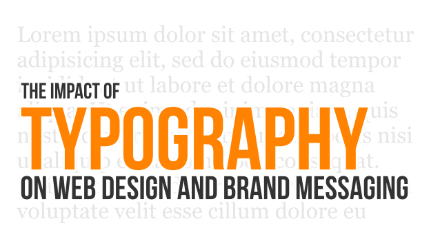
As web design has advanced, it’s clear that most design is driven by big, powerful imagery. However, we can’t ever lose sight of the fact that typography is the lynchpin that holds effective design together. Many factors, such as font selection; appropriate Measure; typographic size hierarchy; and typographic weight hierarchy guide users through the site experience. Typography creates visual logic and directs users to the many messages that marketers need to deliver. With all the resources put into message development, understanding how they’re presented on the web is critical. Let’s look at a few typographic elements which impact the presentation of messaging on any site.
As a top Cleveland brand, marketing and web design agency, we find ourselves involved in all aspects of the design process, from discovery all the way to deployment. This comprehensive approach enables our designers and content creators to work together and take all perspectives into account. Our brand messaging experts consider the medium (website, social media, print, etc), and develop messaging and copy that works for the selected application. At the same time, rather than just dropping it into a layout, our designers will examine the copy and suggest changes that will maximize message effectiveness.
Our web designers focus on using typography to draw site visitors in and direct their attention to key elements in the layout. Typography is therefore used to guide a visitors’ eyes upon their arrival. As we know, site visitors will first scan the site and choose what they should read first. It’s important for brand and navigation to be clear and easy to locate. Effective design will use typography to draw attention “calls to action” and high-level brand messaging.
Let’s address an important aspect of typography in web design: consistency! Effective typography implements a set of guidelines used throughout the site, creating a simple hierarchy of messaging. We quickly “train” visitors to expect headlines, titles and calls to action to be presented consistently within the design. This system of typefaces, font sizes, line heights, and widths, ensures that visitors don’t have to “learn” new design and layout rules as they navigate. A successful typographic system intuitively indicates where one should start reading and how to proceed down the page. Failure to establish such a system can lead to a site looking and feeling busy. More important, system failure will result in key brand messaging being missed.

Macro-and Micro-typography are both essential elements in developing a typographic system. Macro-typography focuses on overall structure of the type, how it is presented in the context of your site’s layout, and it’s general aesthetic in relation to the color scheme, images and other website elements.
A few important elements of Macro-Typography and Micro-Typography are:

Traditionally, we first address Macro Typography, taking care of the “larger” items in our system, then move on to Micro Typography, where we fine tune the structure.
Another important aspect to consider is color. Have you ever visited a website where links or other text elements were difficult to read due to the web designer’s color choices? Sometimes, web designers fail to create enough contract between the background color and that of the text, essentially drowning the text and making it invisible. Clearly, black text on a white background provides the most contrast, but there are many type color combinations that can achieve great results.
In a world often focused on buzzwords and cliches, typography is often overlooked as an integral element of any touch point. Text should not simply be slapped onto a web page. Macro- and Micro -Typography elements must be considered in order for the text to support and contribute to the overall design and the effective communication of brand messaging.


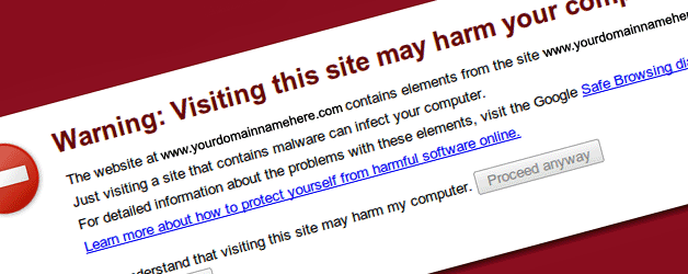 Beware of Malware on your Website
 Purely Branded begins Walden project
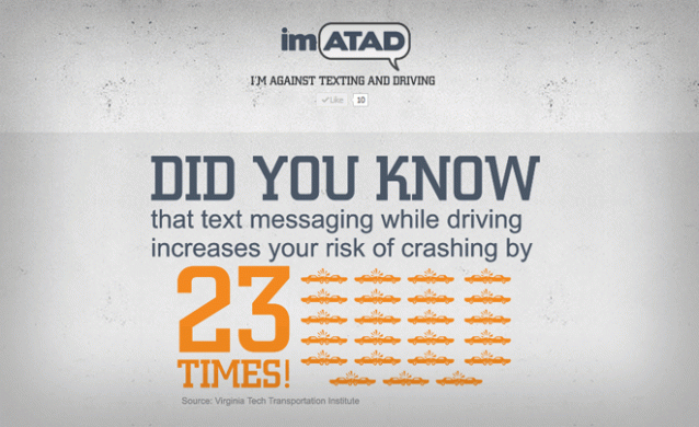 Purely Branded Launches a Coming Soon Website for Cleveland Non-Profit imATAD